work/ Repayment build
Play figma case study presentation
DESIGNING THE REPAYMENTS
USER TESTING
RESEARCH
INTRODUCTION
In early jan 2024, we started on a journey to refine our Ninja Trade Card platform, which is our credit loan platform . Now, we're refining our experience further, particularly focusing on improving the repayment process. Leveraging usability research and design, we aim to address existing challenges and enhance user engagement with our app.
DATA ANALYSTICS FOR IMPROVEMENT
Over the past 10 days, we closely monitored the performance and adoption of our NTC (Ninja Trade Card) repayment flow. Considering the current data we had
MY ROLE
Responsible for research, ideation and visual design of the features
TEAM MEMBERS
One Designer , Three PMS and the Development team.
TIMELINE
6 WEEKS
₹
Given the low adoption rates of NTC flow observed in the data analysis, our primary objective is to improve timely loan repayments.
12:30
Transaction History
All Transaction
Repayments
Loans
Search
Sree Renuka Traders
26th Jun
Successful
- ₹ 50,000
Sree Renuka Traders
26th Jun
In Progress
- ₹ 50,000
Sree Renuka Traders
26th Jun
Authorised
- ₹ 50,000
Maa Kali Traders
26th Jun
Failed
- ₹ 50,000
Repayment #23234
Repayment #23234
26th Jun
26th Jun
Successful
Pending
₹ 50,000
₹ 50,000
Sree Renuka Traders
26th Jun
Failed
- ₹ 50,000
Withdrawal
22nd Jun
+ ₹ 50,000
Successful
Sree Renuka Traders
26th Jun
Consent Pending
- ₹ 50,000
12:30
Repay
₹ 5,00,000
Amount to be repaid
Late fee applicable on delay beyond due date. To avoid late fee and maintain good credit score, do repay on time.
Repay
Date of Transaction
28 th Jun, 2023
UPI/UTR_57296726840962
Account Number
Loan ID
12345
Due Date
30th Jun
Total amount to be repaid
₹ 10,580
Principal
₹ 10,000
Interest
₹ 500
Penalty
₹ 40
Charges
₹ 40
Loan Start Date
28 th Jun, 2023
Due on: 22nd Jun
Repayment worth ₹ 1,00,000 is still pending with our banking partners, you can repay only
upto ₹ 4,00,000
Account Number
8888777733334012
IFSC CODE
IFSC0123213123
UPI ID
a.anurag2121@okaxis
Pay to below account
How to pay in three steps
Copy above bank account details.
Pay via your preferred banking mode.
Check your updated limit after sometime.
Done
Kindly ensure you do not pay excess amount.
If excess amount is paid it will be refunded within 7-14 business days.
PROBLEM STATEMENT
Users were not effectively utilizing the repayment flow in the Ninja app, leading to a lack of trust and engagement with the app for payment-related activities. This issue had significant repercussions, such as delayed payments, unreleased limits, lost business opportunities, and even the termination of field staff due to missed targets.
BREAKING THE PROBLEM STATEMENT
🧠 User Awareness of Repayment Status.
Users were unaware that repayment details and statuses were available in the Ninja app's repayment section, leading to a lack of usage of this feature.Lack of visibility of details was important to tackle.
🌐 Payment Behavior and Trust Issues:
Users find it challenging to track outstanding loans within the transactions, highlighting a need for improved clarity and transparency in both repayment options.
📶 User Behaviour in Low Network Areas
Our target users often operate in low network areas and may have limited technological familiarity, making it challenging to adopt to repayment methods we provide them.
QUICK OVERVIEW OF SECTIONS IN CASE STUDY
Click on them to read them directly in the case study.
RESEARCH AND USABILITY TESTING: UNDERSTANDING USER NEEDS
Being a design school kid , every solution starts with a research 😃
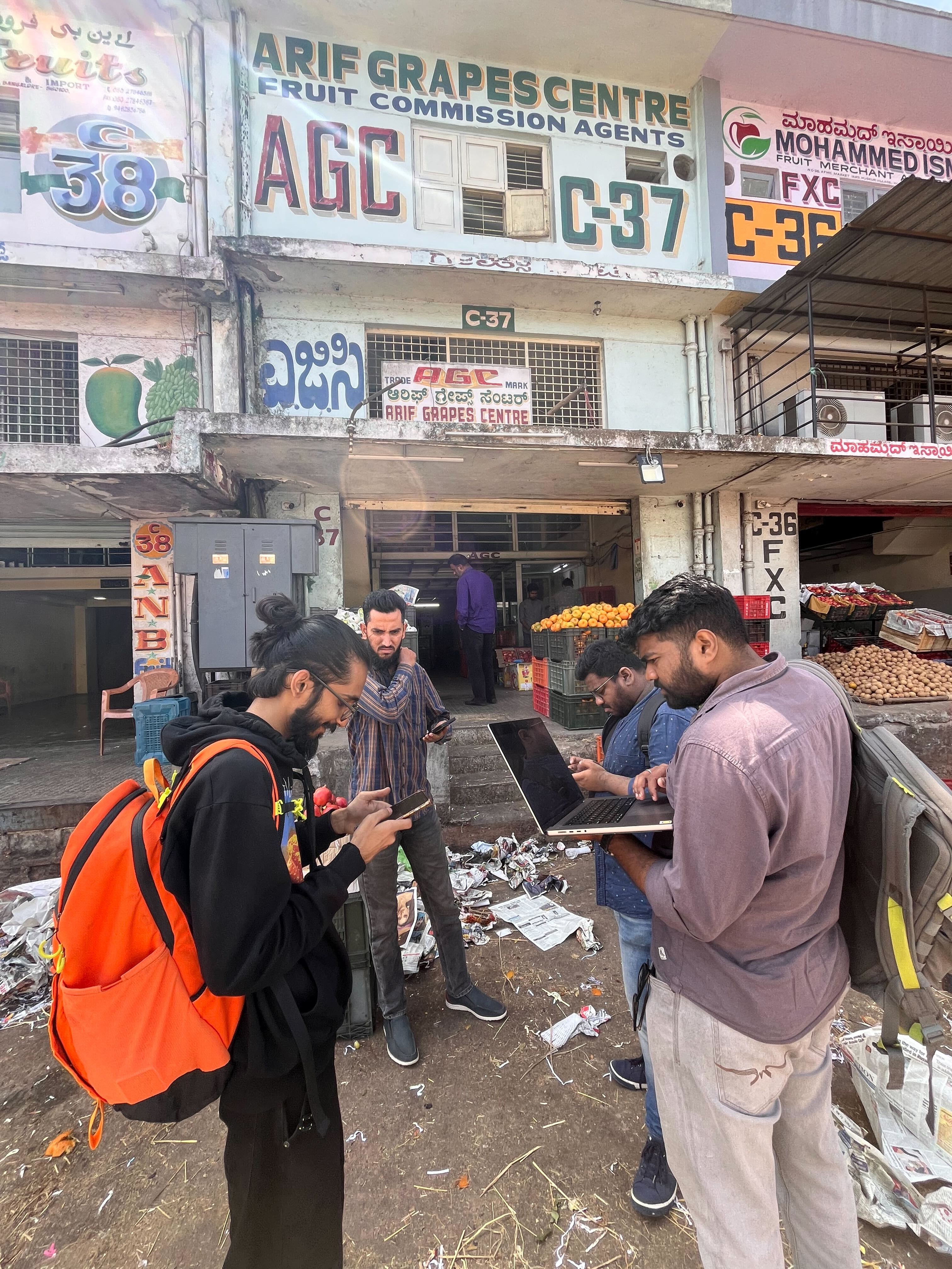
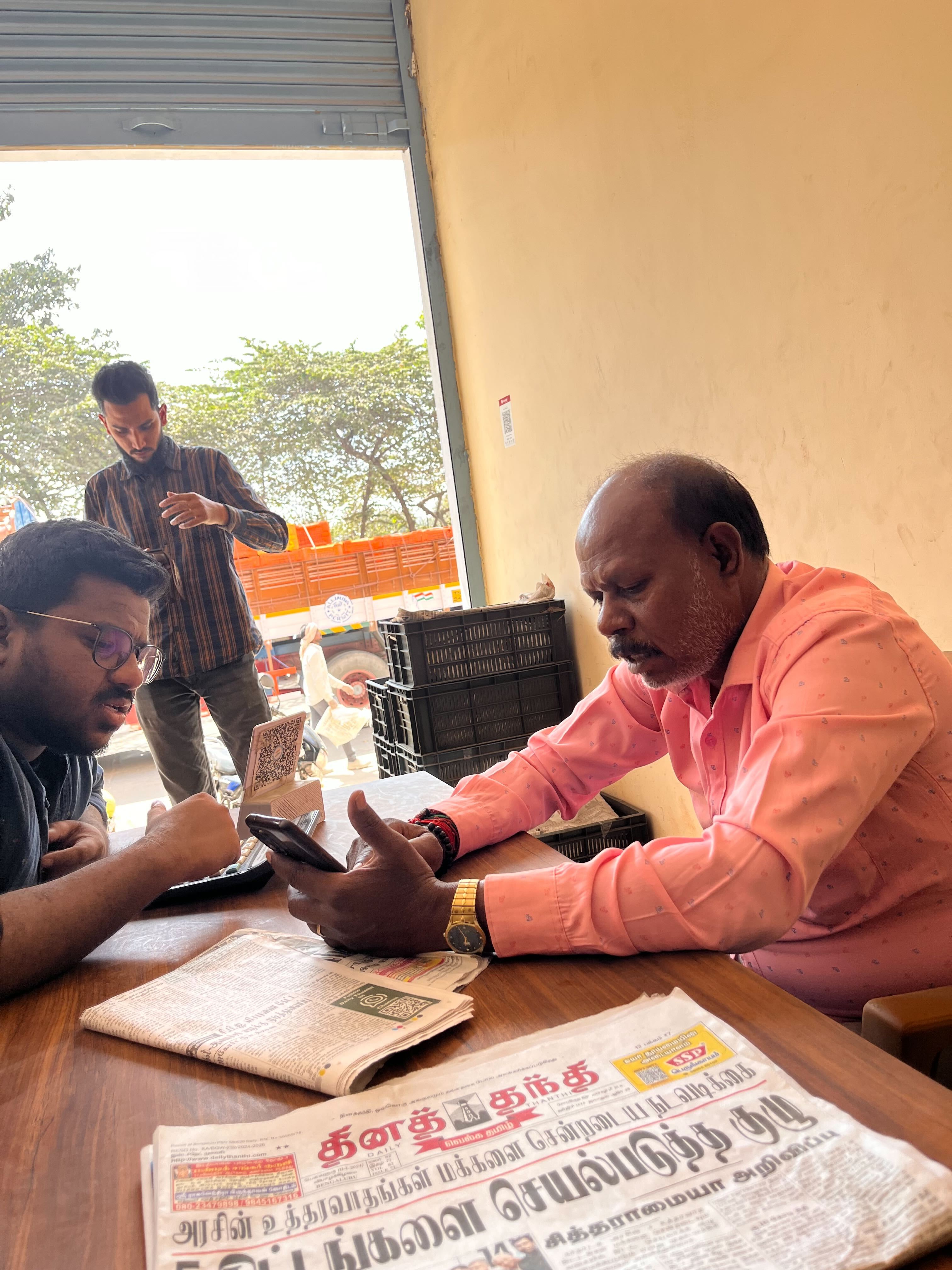
After the product manager identified issues with the repayment flow, our team decided to conduct exploratory research by visiting the nearest market in Huskur. There were few things along with repayment we needed to identify by first hand experience.
As a designer, we felt it was crucial to get a firsthand perspective from our users. So, we packed our essentials and headed straight to Huskur Fruit market in Bangolore, ready to engage in meaningful conversations. We had in-depth conversations with seven users to gain a deeper understanding of the problems they encounter while navigating our loan app and managing their repayments.
Through conversations, I listened intently as they shared their experiences and frustrations. It became evident that there were several hurdles hindering smooth loan repayment processes.The goal was to gather qualitative insights that could guide design improvements to our repayment process and make it more user-friendly.
USER INSIGHTS FROM AFTER TALKING TO USERS
🎨 Insufficient Visual Aids for Comprehension
Some participants appreciated the visual aids in the older flow, such as identifying red as the color for overdue loan repayments.Specifically, users desired clear visual cues to help them quickly identify late payments and track the number of days since the loan was taken.
🔍 Difficulty Finding Loans and Repayments
Since most users relied on the "All Transactions" tab, they had difficulty locating specific loans and their corresponding repayment details after they pay. The lack of a dedicated search or filtering options made it challenging for users to efficiently track and manage their loan obligations.
🔄 Imbalance Between Assistance and Independence
Users had mixed preferences regarding the level of assistance provided in the repayment process. Some desired more guidance, while others felt excessive assistance from cluster heads made them dependent and hindered their independence. Striking the right balance between support and self-reliance was crucial
📶 Network Connectivity Issues Causing Repayment Delays
For users in areas with poor network connectivity, the repayment process was complicated by slow internet access. They often waited until the last minute to make repayments, which, combined with low network speeds, resulted in freezing or crashing of the app during transactions.
📱 Digital Literacy Gap in our applications.
Users with lower digital literacy, particularly those relying on other banking application, face challenges in navigating repayment apps. They prefer more literal interfaces and larger buttons for interactions.
ANALYSIS AND BRAINSTORMING
After analyzing the research insights and sub-problem statements, I proceeded to address each challenge systematically, focusing on one at a time.
We conducted a brainstorming session and affinity mapping exercise to categorize and cluster the insights around each sub-problem. The objective was to organize and synthesize the qualitative data, identify patterns and relationships, and ultimately reframe the sub-problems into "How Might We" (HMW) statements to guide the design solutions.
I collaborated with my senior product designer to explore potential solutions. Here are some snapshots and sketches from our brainstorming process before transitioning to Figma for designing the solutions.
HOW CAN WE SOLVE IT.
Following in-depth analysis and brainstorming for the Ninja Trade Card app, we crafted specific How Might We (HMW) statements to tackle user challenges effectively. The subsequent phase of this project involved creating final screens tailored to address each HMW statement.
INSIGHTS AND HOW MIGHT WE STATEMENTS FOR FINAL SCREEN
Revealing Hidden Payment Info:
After ideating we found users often overlook vital repayment details buried within the Ninja Payment App, leading to disengagement and mistrust.
How might we show these hidden repayment insights, ensuring they're prominently displayed and easily accessible, thereby giving user confidence and participation in managing their payments?
Making Things Easy to Find:
After ideating, we've pinpointed a common challenge: users struggle to swiftly access and identify transaction details within the NTC app.
How can we streamline the search and filter functionality to ensure seamless transaction identification, to enhance user satisfaction and engagement with the app's interface?
Helping Out in Areas with Connectivity Issues:
Users in regions with limited connectivity and lower digital literacy levels often resort to physical banks to refill their digital accounts and repay loans, hindering the adoption of digital payments in Ninja app.
How might we empower users in these areas to manage repayments through the Ninja Payment App, reducing dependence on physical banking services?
DESIGNING FOR REVEALING THE HIDDEN PAYMENT INFORMATION
NEW REDESIGNED HOMESCREEN
After thorough research, we discovered a common issue: users often found it confusing to navigate through loan procedures and repayments due to unclear user interface designs. Many relied heavily on assistance from our field experts, signaling a need for a more user-friendly approach. With this insight, the idea was to develop a home screen that simplifies processes and gives users more control. We aimed to create an interface that is streamlined and also with clear, easy-to-understand visuals
KEY DESIGN CHANGES
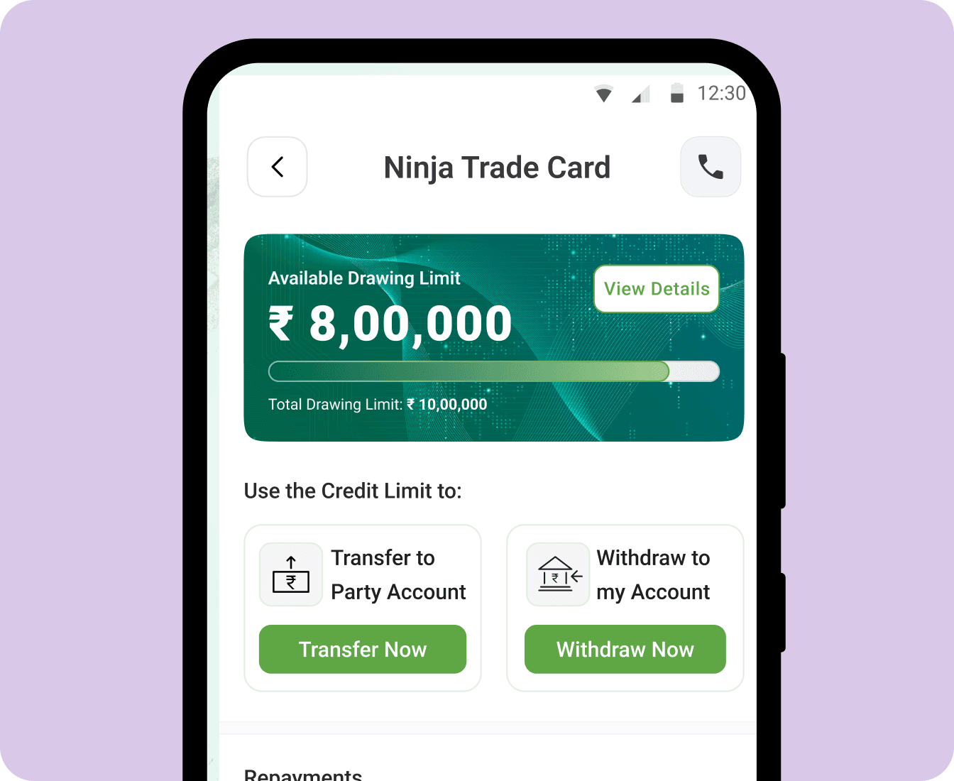
Trade Card Redesign: To improve the user experience, we redesigned the trade card to be more concise, focusing only on essential information. This made it easier for users to understand and interact with the card.
Loans and Repayment Section: We broke down the loans and repayment section from the older screen into two parts to make them more prominent for users. By using prominent buttons and UX copy with everyday language, we aimed to ensure that users could easily understand and navigate these sections.
Repayment Tab: To encourage users to engage with the repayment process more actively, we redesigned the repayment tab to be a tappable card, displaying important information like the number of overdues and subtle UX copy about penalties if not paid.
Transactions Tab: In the transactions tab, we added tags about loans and paid transactions to provide users with more context about their financial activities. This addition aimed to help users better understand their transaction history and make more informed decisions.
A redesigned NTC screen for clearer navigation and understanding
REPAYMENT REMINDER BANNER ON HOMEPAGE
In response to underutilized repayment sections and a need for increased user engagement, we implemented a nudge on the Ninja app's home screen. Recognizing the importance of prompting users about their overdue/due payments, we took few decisions to optimize effectiveness.
Some Key Decisions:
Omission of Dates: Instead of displaying specific due dates, which could lead to confusion for users with multiple loans, we opted for a more general "Overdue Repayment" message with the total amount.
Red Color Scheme: Our research told users' association of red with repayments, capitalizing on the psychological association between the color red and urgency, we utilized a bold red color scheme for the nudge.
Clear Call-to-Action: By using a prominent button within the alert, we provided users with a direct entry point to the repayment section. This not only streamlined the user journey but will also empower users to proactively manage their due repayments.
Prompting users with bold alert for overdue repayments of outstanding payments.
DESIGNING FOR MAKING THINGS EASY FOR USERS TO FIND
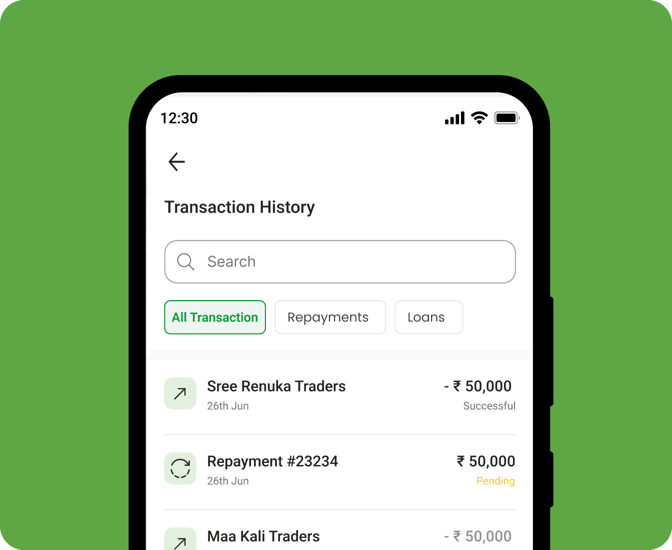
DYNAMIC SEARCH BAR AND PAYMENT FILTERS
When we dug into how our users interacted with the transaction screen, we discovered a common struggle: they often had to sift through numerous transactions to find specific loan details, typically by searching for familiar trader names. Understanding that our users frequently utilized popular payment apps like PhonePe and their native banking applications, we set out to revamp the transaction screen to cater to their needs more effectively.
Some Key Design Decisions:
Dynamic Search:
We added a dynamic search function to help users swiftly locate loan and repayment details by searching for specific trader names or keywords. Drawing from user behavior in other apps, this feature aims to streamline information retrieval.
Filters: Focusing on loans and repayments, we designed filters to align with these key categories. Our current filters are user-friendly and straightforward, with plans to enhance them further based on user feedback and evolving needs.
Tagging System: Tags for loans and repayments were integrated into the transactions tab, offering users additional context and aiding in the quick identification of relevant transactions.
A helpful ,more intuitive way to search and filter on transactions screen
DESIGNING FOR LOW NETWORK AREAS
SMART COLLECT BOTTOM SHEET INTERACTION
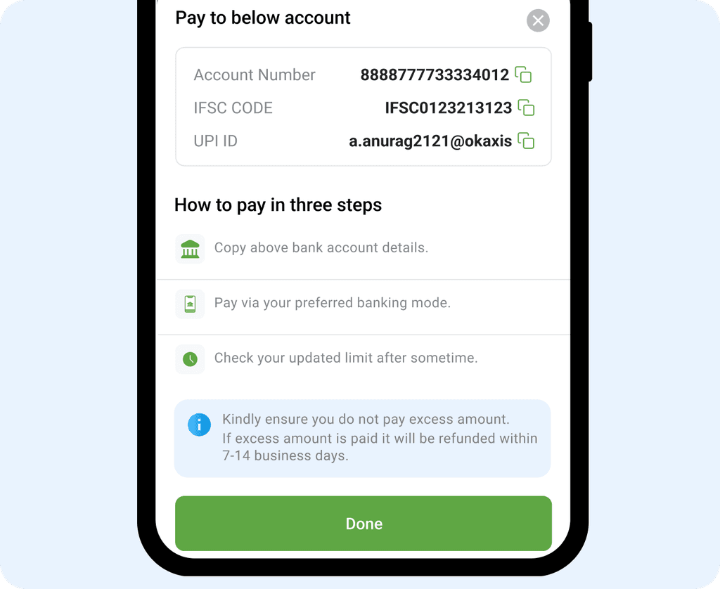
At times, users may encounter network errors that prevent them from making payments through our application. To address this issue, we've introduced a smart collect feature that enables users to transfer payments quickly and easily through any third party application to repay loans.
Key Design Decisions:
Smart Collect Feature: We've introduced a smart collect feature that enables users to transfer payments quickly and easily using a bank account and details provided to them. This feature is designed to help users make payments with their third party applications.
Step-by-Step Educational Approach: Recognizing the importance of user understanding, we crafted informative screens section on how to transfer money and gave an positive alert to anticipate potential errors.
Our goal was to equip users with the knowledge to navigate payment processes autonomously.
Blanket Error Screens: During moments of network failure, we understand the importance of alleviating user anxiety and providing a clear path forward.The prominent "Try Again" button offers a straightforward option to attempt reloading the page, preventing it from becoming a dead end.
A helpful ,more intuitive way to search and filter on transactions screen
CONCLUSIONS AND LEARNINGS
With the introduction of the new flow, the team witnessed a significant improvement in the repayment rate through the new flow. From an initial adoption rate of 28%, the new flow facilitated an increase to around 48% when it was mapped and measured.
THINGS I LEARNT DURING THIS PROJECT
🎨 Balancing User Needs with Business Goals:
I've realized that designing in a fast-paced environment requires finding the right balance between meeting user needs and ensuring our business goals aren't compromised. It's about creating solutions that prioritize users while also aligning with our company's objectives.
💬 Collaboration is Key:
Working closely with PMs, developers, and Senior designer taught me the importance of constant feedback loops. Effective collaboration ensures everyone is on the same page.
🔍 Thriving in Constraints:
Designing within constraints, such as existing user behavior and introducing new features, was a valuable experience. It challenged me to think creatively while maintaining consistency and familiarity for our users.
💳 Designing for Unique User Groups:
Designing for our unique target user group of Bharat users was eye-opening. It required a shift in mindset and understanding their specific needs and behaviors, which differed from other user demographics.
©2024 (A.S) — Back to Top


